Table of Contents
ToggleFind Licensed Images
In this article, we are covering how to find licensed images in Cricut Design Space. Licensed images include images like Harry Potter, Disney, Marvel, and so much more before we get started, it is important to note that licensed images are intended to be used for personal use only. Licensed images are also an additional charge, even if you’re a Cricut Access member.
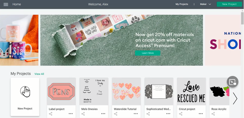
But the great thing about buying these in Cricut Design Space is once you purchase them, they stay with your Cricut Design Space account, Free so you can continue to use them in future projects. It’s also great that they’re in Cricut Design Space because they are super convenient, and you always know that they’re compatible with your Cricut machine. So let’s begin in the Cricut Design Space home screen, we will select New Project, and this will take us to the Canvas.
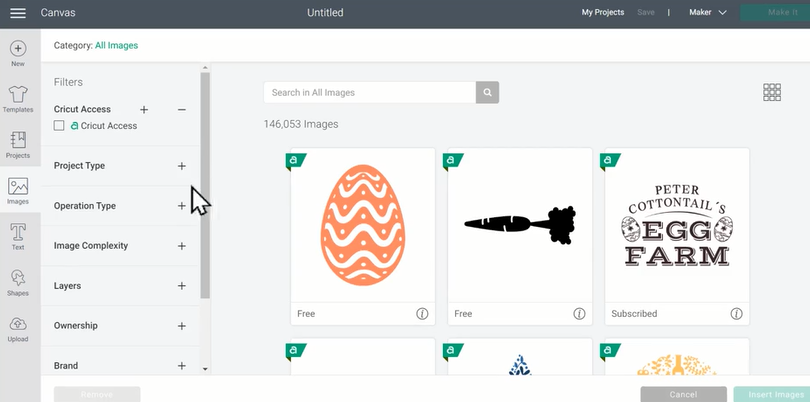
Then we will move to the left side of the screen and well select “Images” in the Design panel. Once you get into Images, you can use the filters on the left-hand side of this screen to find the images that you are looking for. If you don’t want to pay for images, you can go under the ownership and select “Free”. Then you can see lots of images that are available, that you don’t have to pay for in Cricut Design Space. But keep in mind; these will not include licensed images. When searching for licensed images, you’ll want to click the “Brand” drop-down menu. And then you’ll see all of the different categories that licensed images are available.
“Warner Brothers” includes items like Harry Potter images, and even the show Friends and so much more. You can also sort the images by Disney, Star Wars, Marvel, Sanrio, like for Hello Kitty, and even Sesame Street. So there are tons of great images to look through. I’m going to begin by sorting by Disney and finding an image of Mickey Mouse. Free I think this image looks perfect. So l am going to click it to select it and then choose “Insert Images“.
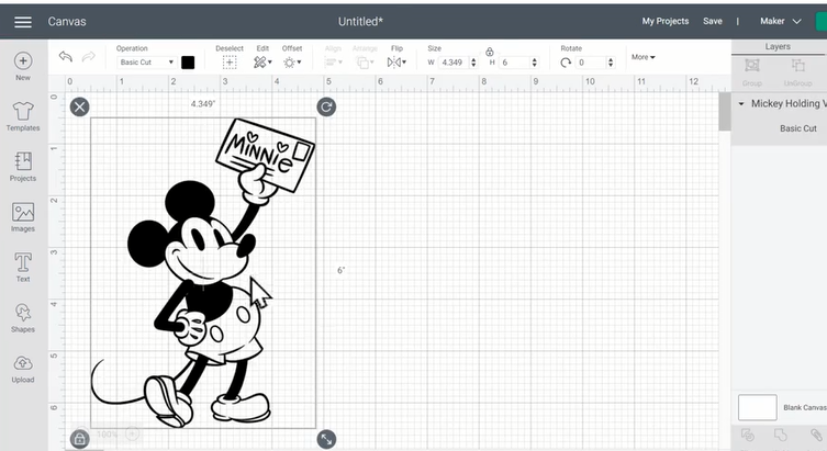
Once an image is inserted in your canvas, then you can make any, changes to it that you wish. You can add additional text and even more images if you’d like. Then, once your project is ready, you can click the green Make it button. If you go beyond this screen, which is called the Prep Screen, you will be charged for your image, but you are able to add images into your canvas so that you can test them out and see if you like them before you purchase them. I hope that you are more comfortable now finding licensed images.
Create a Split Image
Let’s take a look at how to create your own split designs in Cricut Design Space. Once we are open in Cricut Design Space on the home screen, you can start by clicking ‘new project. This will take us to the canvas.
Then we’re going to go to the design panel on the left-hand side and select ‘images’ so that we can find an image that we want to create with our split design. So I know that I m going to use a sunflower for my split design. So l am going to use the search bar to type in ‘sunflower’. Then you can scroll through all the available designs to find out which one you want to use. I am going to use this sunflower right here, but before l insert it into my canvas, want to explain how you know the design is going to look good as a split design.
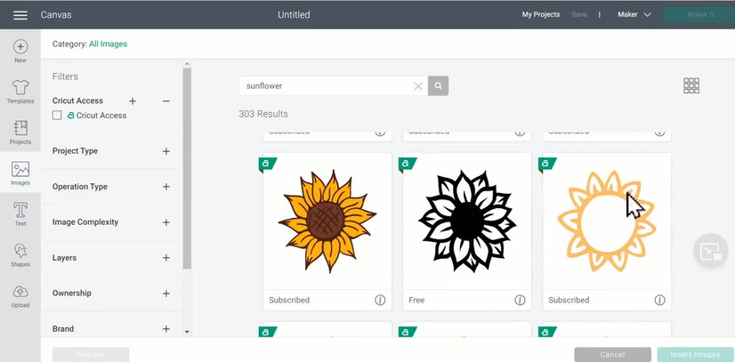
The way that you will know if a design is going to work well for this project is if you can actually cut out the middle and not lose any detail. So you can still tell what the design is. In this case, the petals go all the way around so it’s always going to be a good choice. But let me show you an example. This sunflower here has leaf detailing on both of sides. So if you took out the whole middle of this design, then you would lose a lot of the detail and you may not be able to tell that it’s a sunflower so keep that in mind whenever you are choosing your design. So once you find that design, go ahead and click it so that it’s highlighted with the green box, and then select ‘insert‘ images.
Once the design is in the canvas, you can use the arrows in the bottom right of the bounding box, which is just this box that lets us know the project is selected, to resize the image. So I am going to make it fairly large. Then we are going to go back to the design panel on the left-hand side, and under basic shapes, we are going to select a square.
Once you have a square on your canvas, you can unlock it using the lock in the lower left-hand corner of the bounding box. Now I am going to stretch it to make it a rectangle. This is basically going to be the area where you’re going to have to type your text and your split design. So you can size it, however, you’d like, and then you want to stretch it so that it’s longer than the design in the center.
I am going to make it a little bit smaller, make it something like that. Then once you’re happy with it, you can click and drag a box around both items so that they’re selected on the right-hand side on the layers panel, and select ‘slice.’
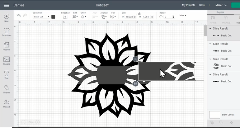
Once the slice is finished, you can drag away all of the pieces and delete each of them because you don’t need them anymore. Leave this piece here. So now we’ve got the basics of our split design. Well, let’s take a second to make it look a little bit more refined. So go back to the design panel on the left-hand side. And select ‘Shapes’ again, and then choose a square.
Now we’re going to unlock it again, using the lock in the lower left-hand corner and stretch it into a really, really thin rectangle. Then ‘m going to use this rectangle and line it up along the bottom of the design, something like this. It needs to be a little bit longer than the design, but not a whole lot. Then I am going to drag it, so it’s actually connected to the bottom of the design, just like that. Then when you have a rectangle, that’s a shape you like you can select it and then choose duplicate over top of the layers panel. That way you get a rectangle of exactly the same size. Then you can take this rectangle and line it up across the top of the design.
Then to make sure everything is exactly in the right place, you can click and drag a box around all the shapes to make sure everything is selected. Then at the top of the screen, you will use the ‘align’ tool and then select center horizontally.’ This will make sure that everything’s all in the center. Now that everything is still selected, I’m going to go to the bottom of the layers pane and choose ‘weld.’ These will make the rectangles a permanent part of this design.
Now it’s time to add text to our split design. So we will go back to the design panel on the left-hand side and select ‘T’ for text. Then we’ll type in whatever text we want to use in the middle of the split design. I am going to make this a teacher’s gift. So I’m going to type “Mrs. Smith Next, you can change the font if you’d like, make sure that the text is selected and go up under font and click the drop-down menu to see all of your font options.
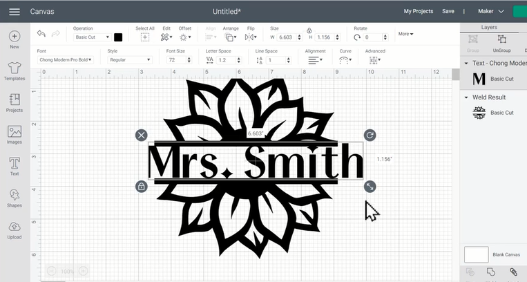
A really fun font that I like to use, and is really easy to weed, is Tom Modern Pro Bold. Plus, I like the little bit of style that it has. And once your text changes into the font you like then you can use the arrows in the bottom right-hand side of the bounding box to make your text fit well into the design. Then, in order to center everything, I’m going to click and drag a box around both the texts and the design, and then use the ‘align’ tool again, to center horizontally.
Then with everything still selected, I will click ‘attach’. This will ensure that when I go to the makeup screen, everything cuts exactly the way that it looks on the canvas. So then if we click the green make it button you will see that on the prep screen, it looks exactly as if we made it on the canvas, and that’s it. You have made your own split design. Hope that you’re ready to go create your own split designs in Cricut Design Space.
