SVG Design Editor - Product Help File
SVG Design Editor for Creative Makers starts with the free version that offers a rich set of tools for creating vector-based designs using shapes, text, fonts, design objects and object packs. Upgrade to a paid version to gain access to many thousands of design elements to suffice your creative needs. The application can be used as a standalone SVG design canvas, as well as a companion app for Cricut Design Space©. Read the product help file and guide below to learn how to use the app.
– Advertisement –
Product support
Have questions regarding the functions of the product, license acquisition, or want to provide product feedback? We love to hear from you:
- Email our support team: huxsoft[at]outlook.com – replacing [at] with the @ sign
- If you have encountered an issue while using the app, explain the nature of the problem, with steps to follow in order to reproduce it
- If the issue is related to a particular SVG design file, please consider attaching the file to your email
Our knowledgeable and friendly support team member will get back to you in a timely manner.
Table of Contents
The Main Window
SVG Design Editor’s main window provides access to all features and functions. As marked in the image below, it consists of four areas:
- File Menus and Top Toolbar
- Side Toolbar
- Properties
- Canvas area
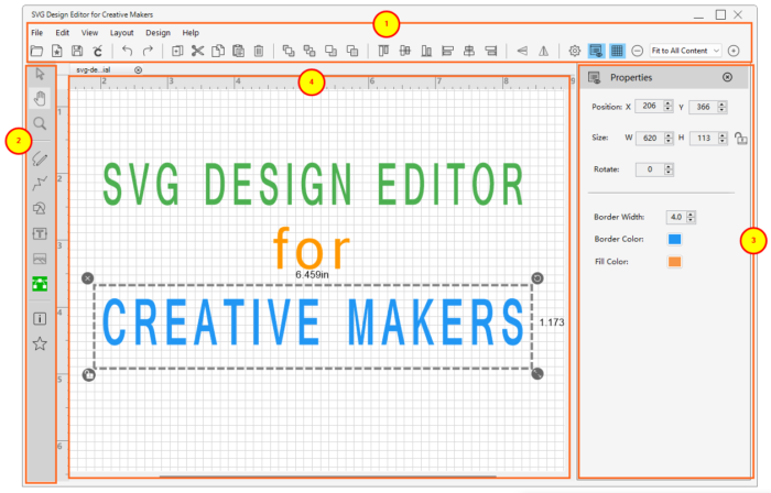
The Side Toolbar provides access to all creative tools like pen , path , shapes, design elements, and text or image insertion tool. With these tools, you can create and modify SVG-based design in the canvas area.
The Properties window displays options of an object (e.g. text or shapes) that’s currently selected in order for you to make adjustments. The File menus and Top Toolbar provides file-based operations and arrangements for objects.
In the sections below, you will learn how to use each features and functions from these four areas to create vector-based designs.
Working with Canvas
Open a new design file
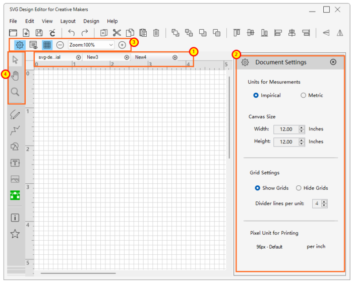
You can create and work with multiple SVG designs by opening more than one canvas at a time. Each canvas is represented by a file tab, as indicated in area [1] marked below. Use one of the two ways to open a blank canvas:
- From the menu: File > Create New Design
- From the top toolbar: click the Create New Design button:

Canvas Settings
Based on your needs, you can adjust settings for each canvas individually. To open Document Settings for the current canvas:
- From the file menu: View > Document Settings
- From the top toolbar: click the gear icon:

Document settings for canvas:
- Units for Measurements: Imperials or Metric, displayed on the top and the left edge of each canvas
- Canvas size: define the width and height of the canvas, in either inch or cm
- Grid settings:
- Show or hide grid lines
- Alternatively, click the Show/hide grid line button from the top toolbar:

- Set the grid granularity as needed to show more or less divider lines between each measuring units
- Alternatively, click the Show/hide grid line button from the top toolbar:
- Set divider lines in between two measuring units
- Show or hide grid lines
Using Mouse with Canvas
When working with a canvas, you can set the mouse to be one of the three modes by selecting an options from the top portion of the side toolbar:
- Selection mode
 : use the mouse to select and modify object(s). This is the default and the most frequently used
 - Panning mode
 : click and hold the mouse to move the entire canvas to a location for optimal display
 - Zoom mode
 : put the mouse into the zoom mode, left-click the mouse to zoom in or right-click mouse to zoom out
Zooming
You can also use the zoom feature in two other places:
- from the file menu: View >
- Zoom in / out
- Fit to Canvas: maximizing the display of the entire canvas in the viewing area
- Fit to Selection: maximizing the display of the object(s) currently selected in the viewing area
- Fit to All Content: maximizing the display of all objects in the current design in the viewing area
Save or Export Designs
- Save the current design: you will be prompted for the name and location of the design file if it is for a newly created design that has never been saved before
- File > Save, or
- From the top toolbar click the Save button:

- Save the current design as a new file, in one of the following formats: SVG, PDF, BMP, JPEG, WEBP:
- File > Save As…
- Export to Cricut by optimizing the file content to be compatible for Cricut:
- File > Export to Cricut
Create a SVG design
Once you have opened a new design file, it’s time to carry out the design project from how you have envisioned. Each design project consists of one or more design objects, like path, shapes, elements, text, and images.
Design objects
A design object is a single unit of design that can exit by itself. You can insert, modify, or delete it, as well as group it with other objects. SVG Design Editor offers the follow types of design objects:
Basic Design Objects
The two design objects directly accessible from the side toolbar are:
- Pencil
 :
:- Click the Pencil icon to enter the pencil mode.
- Click and hold down the mouse at where you would like to start the drawing
- Continue holding down the mouse button to make the drawing
- Release the mouse button when completed
- Path
 :
:- Click the Path icon to enter the path mode
- Click the mouse at where the path starts
- Move to the next location for the path and click again
- Repeat the step above until all path points are defined
- Right mouse click to close the path
Furthermore, the following design objects can be selected from the Basic Object list of the Shapes & Objects pop-out window, by clicking this button ![]() from the side toolbar.
from the side toolbar.
- Line
- Square
- Rectangle
- Ellipse
- Polygon
- Starburst
- Star
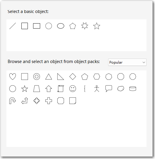
To insert any basic objects, simply click on the object, and it will be automatically added to the top-left corner of the design canvas.
Design Object Packs
On top of the basic design objects, the application provides a set of Design Object Packs that are available from the Shapes and Objects pop-up window as seen above:
- Click the drop-down menu to select an object pack
- Browse through the group of objects available from the pack
- Click an object to add it to the design canvas
Working with objects
After adding a design object, you can modify it to fit the needs of the overall design.
Modify an object
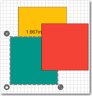
To modify an object, select it to enter the modification mode, which is indicated by the selection box using a dashed-rectangle as shown below.
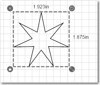
There are four function buttons, one at each corner of the selection:
- Delete button
 : click to remove the design object
 - Rotate button
 : click and hold to rotate the object
 - Aspect ratio lock/unlock button

 : click to toggle between lock and unlock the aspect ratio while resizing the object
 - Resize button
 : click and hold to resize the object. It works in conjunction with the Aspect ratio lock settings
Object properties
Each object offers a set of option, which you can set through the properties pane located at the right side of the SVG Design Editor main window. Click the Properties button ![]() on the main toolbar to Show/Hide the Object Properties pane.
on the main toolbar to Show/Hide the Object Properties pane.
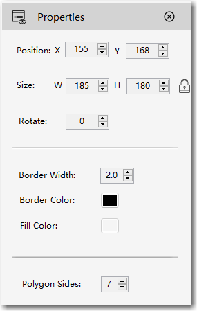
Options for each type of design objects are slightly different, although most of them feature the follow sets of options:
- Position: pixel location of the top-left corner
- Size: width and height of the current object, with a visual indication of whether the aspect ratio lock is set or not
- Rotate angle: degree of rotation from the original settings
For objects that have lines or path as borders:
- Border Width: with in pixel for border lines
- Border Color: color setting for border lines
- Fill Color: color settings for filling the enclosed area of the object
Working with Text
With SVG Design Editor, you can add a text object, change font typeface, select different font size, adjust font space, and change font color.
Add a text object
To insert a text object:
- Click the Add Text button
 from the side toolbar. A default text label will be inserted to the top-left corner of the canvas as shown below
- IMPORTANT:To enter the edit mode, you need to double-click the text label so that all text in the label are select as shown below.

- To edit, start typing the content of the text label
- While in edit mode, you can place the cursor at any position by clicking the mouse at a particular location within the text

- You can move the cursor using the Left or Right arrow key or make a partial selection by clicking and dragging the mouse through a portion of the text label
Modify text object settings
A text object has a list of options that you can set from the Object Properties pane:
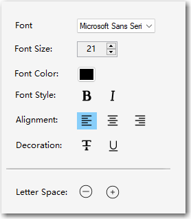
- Font type: choose from a list of fonts that are already installed on your Windows system
- Font Size: increase, decrease, or set font size
- Font Color: select the color of the font using the Color picker control
- Font Style: set the text to be Bold, Italic, or normal
- Alignment: Left, Center, or Right align the text
- Decoration: Strike Through, Underline, or normal
- Letter Space: to increase or decrease letter spacing
SVG Design Editor supports multi-line text label and allows free resizing of text label objects.
To exit the edit mode, click anywhere outside the text object.
Design Elements*
On top of the basic design objects and packs, SVG Design Editor provides Design Elements, a feature that opens access to tens of thousands of SVG designs and icons. By using Design Elements, you can elevate your design to a new level without breaking a sweat. Click this icon ![]() to open the Design Elements window, from where you can browse, search, and insert ready-to-be-used design elements
to open the Design Elements window, from where you can browse, search, and insert ready-to-be-used design elements
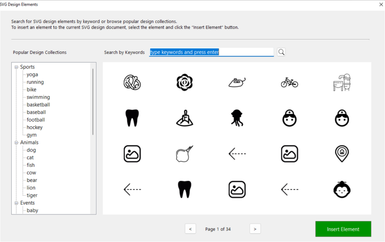
*Please note: the Design Elements is a paid feature. You can browse the design elements collections for free. Nevertheless, adding a design elements to design files requires purchase of a subscription for the application.
Design elements collections
A list of popular design elements collections is readily available on the left side of the window for you to browse. Each collection is labelled by a keyword describing the nature of the group of design elements.
- Click on a keyword, e.g. Yoga, Baby, or Camping, to browse the collection of that keyword, whose matching results are usually displayed through multiple pages in the content window.
- Use the page control button to turn to the next or the previous page.
- To insert a design element, simply select the element, and then press the “Insert Element” button
Search for Design Elements
To make the best use of Design Elements, use the keyword search feature located at the top of the window.
- Type in a keyword or a phrase describing what you are looking for and then press the Enter key
- Browse the matching design elements in the content window using the page controls
- Select a design element of your choice and click the Insert Element button to apply the element to the current design.
Advanced Editing Features
As you manage to work with individual design objects and elements, using the following advanced editing features will help you accomplish your design and creation goals:
- Group
- Alignment
- Arrangement
Select multiple objects
To use any of these features, you need to learn how to select a set of objects. Select multiple objects using one of the two methods:
- Hold down the Ctrl key and click and select each object one by one, or
- Hold download and drag the mouse to select a group of objects within an area
Grouping
After you have inserted a group of objects and elements, finished setting their properties, and arranged the positions and stacking orders, the Grouping feature holds everything together in a single “collection”. You can move a group of objects/elements across the canvas and everything within the group stays organized.
How to group
To group a set of objects:
- Select all objects/elements that belong to the group using one of the two methods mentioned above
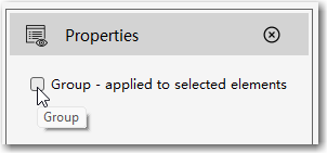
- Check the Group option checkbox from the Properties Window
Let’s say, you have designed a special elephant that has purple ears and green eyes (huh… a bit weird…but just for the purpose of illustration).
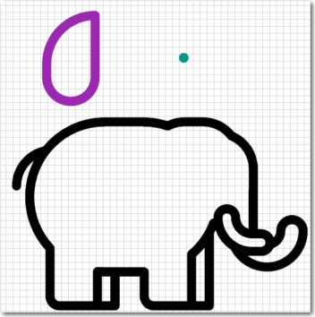
After you have placed the ear and eye in the right positions, use the mouse to select the entire elephant as indicated below.
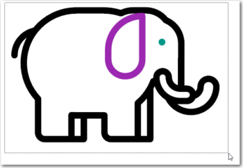
Now the entire elephant, which consists of three objects, is selected. Click the Group option checkbox to create the “elephant” group.
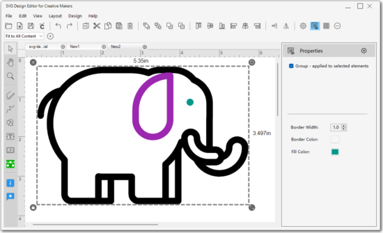
How to ungroup
To ungroup, select the group, then uncheck the Group option checkbox from the Properties pane.
Grouped or not?
If you wonder whether a group of objects have been grouped or not, simply select all objects under consideration and then review the Group checkbox, which also works as an indicator for grouping. If the checkbox is unchecked then the set of objects are not grouped, and vice versa.
Alignment
When multiple objects are selected, the Alignment feature is activated to help placing objects in the right position to each other. There are six alignment functions:
 Align Top: align all selected objects to the top. The furthest element to the top will dictate where all other object move.
 Align Center Horizontal: align all selected objects horizontally centered
  Align Bottom: align all selected objects to the bottom. The furthest element to the bottom will dictate where all other object move.
 Align Left: all selected objects will be aligned to the left. The furthest object to the left will dictate where all other objects will move.
 Align Center Vertical: align all selected objects vertically centered
 Align Right: all selected objects will be aligned to the right. The furthest object to the right will dictate where all other objects will move.
Arrangement
Arrangement refers to setting the stacking orders of a objects, placing it in front of or behind other objects. There are four arrangement options available:
- Bring to Front: move the selected object to the topmost position
- Send to Back: move the selected object to the far back
- Bring Forward: move the selected object one step forward
- Send Backward: move the selected object one step backward
For example, there are three squares, green, red, and yellow:
- At the beginning, the green square is placed at the bottom of all three objects
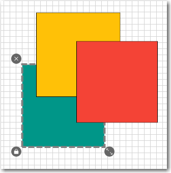
- Select the green square and click the Bring to Front button will move the green square to the top most position
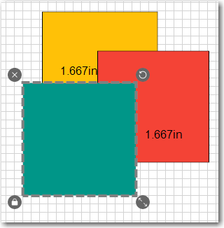
- Click the Send to Back button places the green square to the very bottom of the stack
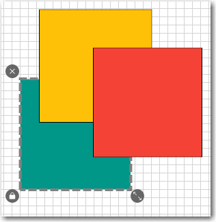
- Click the Bring Forward button twice will move the green square to the top position again, in two steps
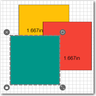
- And then finally, use the Send Backward button to place the green square to be in between the yellow and red square
Working with Cricut Design Space
SVG Design Editor can be used as a standalone application for creating vector based design. Meanwhile, it was also designed to work as a companion app for Cricut users who are familiar with Cricut Design Space. More specifically, SVG Design Editor provides a feature to optimize a design file to be exported to Cricut by working around some of the known limitations (of importing external designs) imposed by Cricut, such as:
- No support for the Ellipse tag
- No support for editable text
- No support for object borders (width or color won’t be retained)
- Cricut converts imported design file using 72 dpi as the default resolution
Our solution for exporting to Cricut
The Export to Cricut function ![]() , which is available from the main toolbar, resolves almost all issues above, except for the boarder problem. When using the export feature, please note:
, which is available from the main toolbar, resolves almost all issues above, except for the boarder problem. When using the export feature, please note:
- While the export process converts a design file with 72 dpi resolution, it preserves the design in its original size/dimension.
- When working with text objects, try to use single-line text object, although the application does support multi-line text input. Doing so helps to preserve the accuracy when converting text to path.
- Set either the border color or fill color to be non-transparent so that the object remains visible after import. As otherwise, a transparently filled object will appear to disappear (but still exists) when Cricut ignores border information while importing.
- The app uses 96 dpi internally. Directly importing a design file, without going through the Export to Cricut feature, changes the physical size of the entire design.
- Cricut creates a new group for each import job. To continue editing the imported object, ungroup it and make modifications to each “part” of the object.
– Advertisement –


